Putting Families First.
As part of my master's program, I teamed up with five other passionate designers to tackle a project that truly mattered: helping the New Zealand Ministry of Justice better serve families in need. Their website was difficult to navigate and failing to connect families in vulnerable situations with essential tools and resources. Our goal? to design a seamless and intuitive digital experience that would meet the user's immediate needs and also adapt with the Ministry's future vision. The solution? a scalable design system that would form the backbone of their digital future.
Deciphering the Challenge.
The New Zealand Ministry of Justice website was outdated, clunky, and a barrier for families trying to access critical services - leaving them frustrated and confused. Our challenge was to make it easier for vulnerable families to find the resources they need - fast. We needed to understand how users interacted with both updated and outdated sections of the site, pinpoint pain points, and propose solutions that would improve the overall experience. On top of that, we had to build something that would evolve with the Ministry's long-term goals, ensuring both users and stakeholders got what they needed.
The Discovery Process.
We dove headfirst into the Ministry's website, starting with a comprehensive audit to pinpoint pain points in its Information Architecture (IA) and usability. Through interviews with stakeholders, we gathered critical insights into their vision for the project and their expectations, ensuring we were on the same page in terms of goals. We conducted comparative usability testing, which allowed us to observe how users interacted with different sections of the site, revealing key usability challenges and areas for improvement. Additionally, a collaborative IA workshop with stakeholders and subject matter experts helped refine the site structure and highlighted inconsistencies between their assumptions and actual user behaviours. This gave us clarity on three key insights: First, content clarity was crucial—plain language over jargon. Second, inclusivity needed to be a priority. And third, collaboration with community groups would be vital to maximize accessibility. These insights guided us in crafting a solution that would truly work for the Ministry’s diverse users.
Designing the Solution.
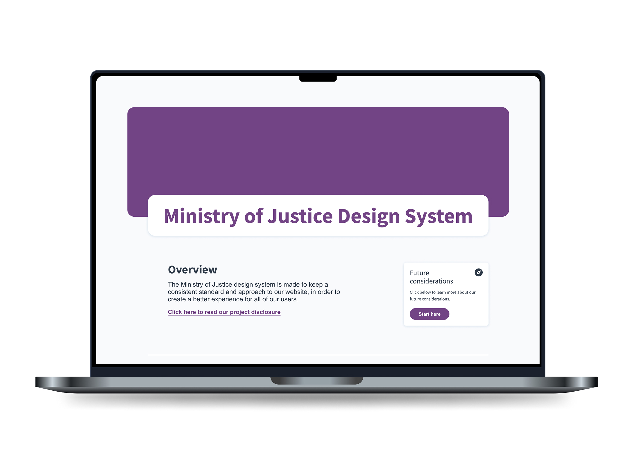
We didn’t just create a design system—we built the foundation for the Ministry’s digital future. Drawing from the best elements of their updated web design, we developed a scalable system that brings clarity, consistency, and accessibility to every page. Designed for adaptability, it allows teams across the Ministry to easily implement and evolve it as their needs grow.To prove its impact, we tested it on the Ministry’s most visited section: the Separation and Divorce pages. Using the updated Care of Children design as a foundation, we refined the structure, improved content clarity, and streamlined navigation. The result? A prototype that demonstrates the full potential of the design system—making essential services more intuitive and accessible.
Beyond the Design.
This project wasn't just a design challenge - it was an opportunity to make a real-world impact. Working closely with stakeholders, listening to their needs and goals, pushed us to create not just a design system, but a future-proof solution for the Ministry's digital landscape.Looking ahead, I can't help but think about the next steps. Usability testing with Ministry employees on the High-fidelity product itself will be key to seeing if the design system really provides the support we intended it to bring, as its the users who will truly determine its success.


